Turn Your Home Into a Gallery
Small spaces are often framed as limitations but in reality, they offer something far more interesting: constraint-driven creativity. When every corner counts, every object becomes intentional. Posters take center stage, objects play supporting roles, and light - always shifting, always alive - directs the entire composition.
What emerges is not just decoration, but curation. A home that feels collected, not assembled. Personal, yet quietly refined. Here are three ways to approach your walls with that same sense of editorial clarity.

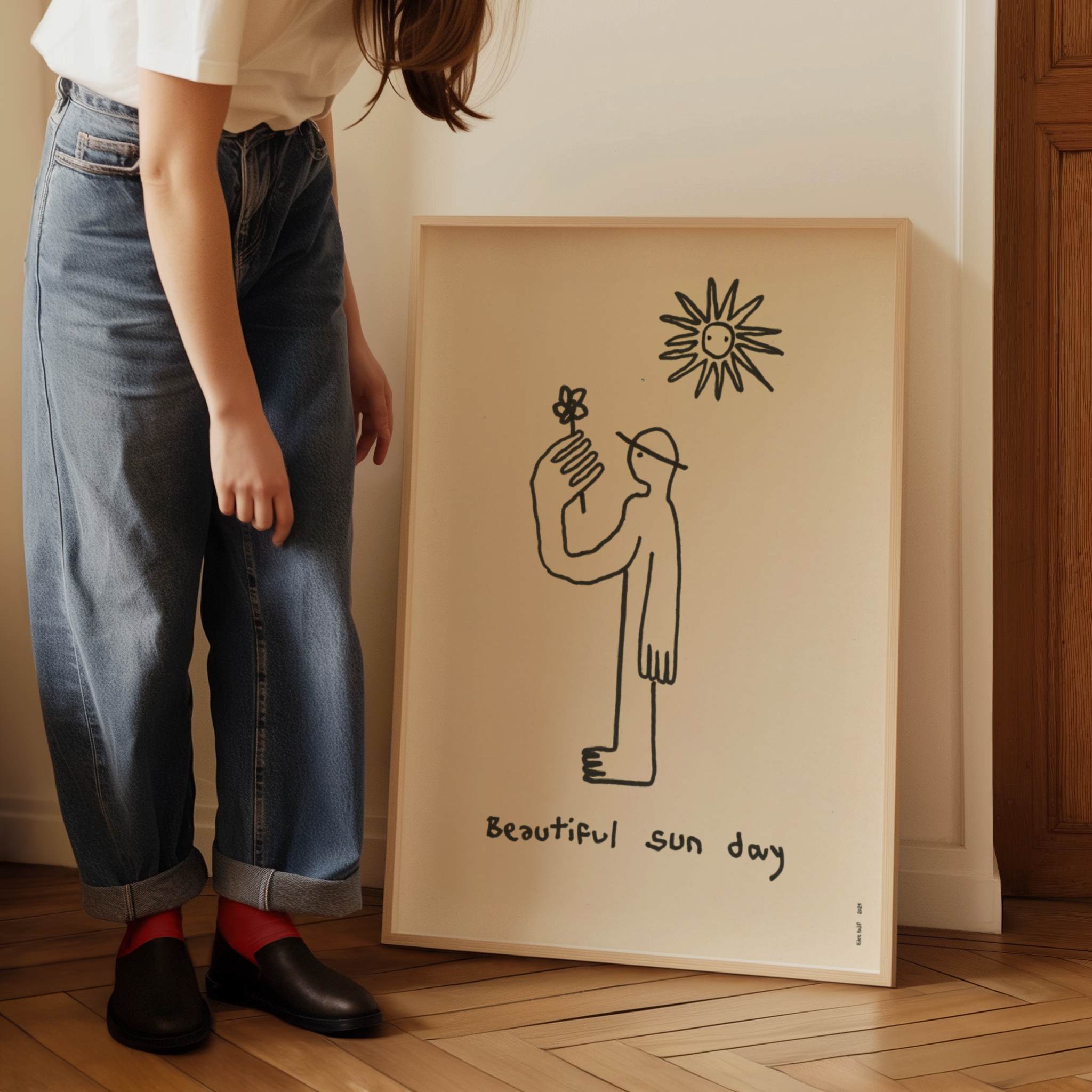
1. Let Corners Speak
There’s something deeply underrated about the corner. It’s transitional, often overlooked, and precisely because of that - it holds potential. Instead of filling it as an afterthought, treat it as a focal vignette.

A single poster, slightly leaning, can soften the rigidity of a room. Or a small pairing - two or three pieces - can introduce rhythm without overwhelming the space. The key is restraint. Let negative space do part of the work.

Anchor the composition with a subtle object: a ceramic piece, a small plant, a stack of well-loved books. These elements don’t compete; they ground the scene.

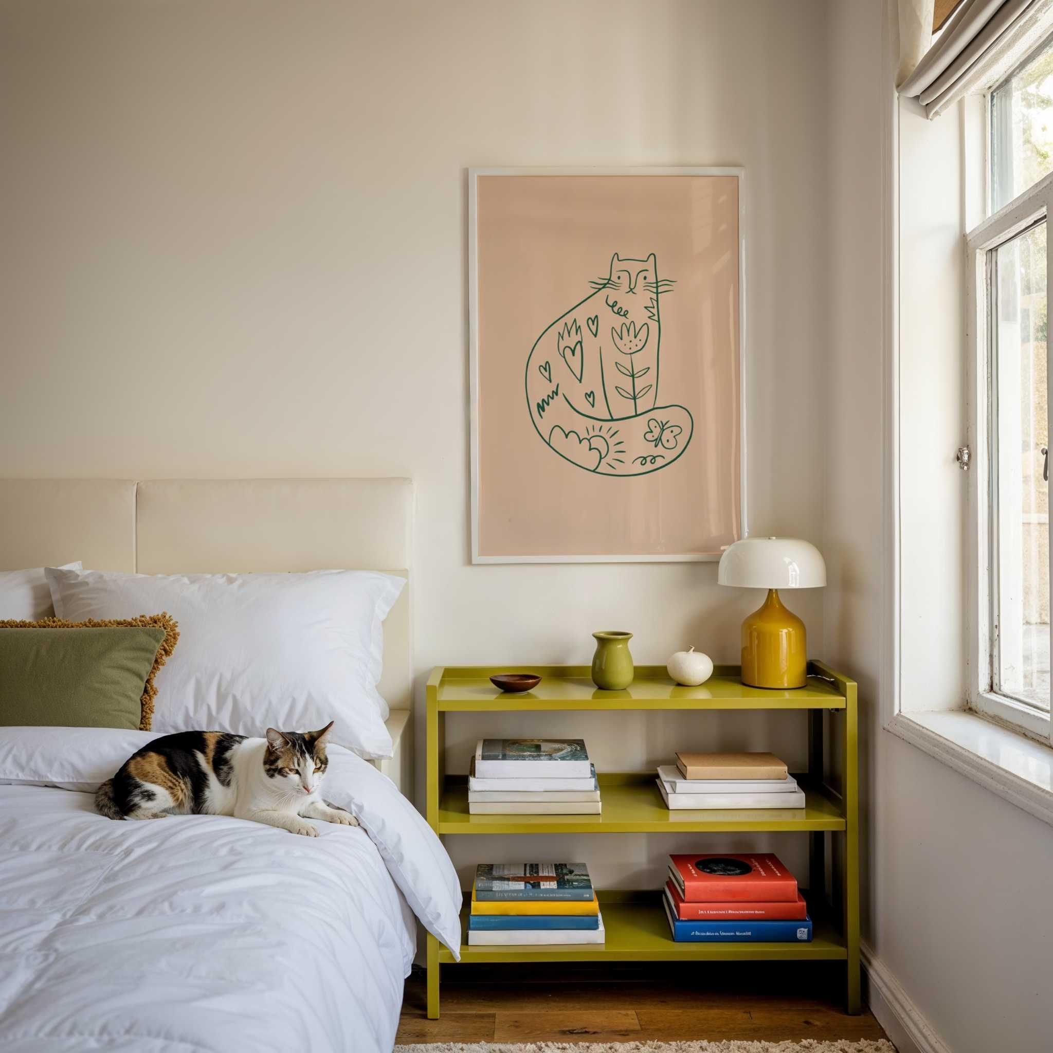
2. Layer Posters with Objects and Light
Flat walls can feel static. Layering introduces dimension - and with it, a sense of life. Instead of hanging everything, try leaning. Place a smaller print in front of a larger one. Let edges overlap slightly. This creates depth without complexity, a look that feels both relaxed and deliberate.

From there, bring in material contrast. Linen, raw wood, glazed ceramics, brushed metal - these textures interact with your posters in subtle ways. A bold graphic print next to a matte ceramic form, for instance, creates tension that feels curated rather than styled.
Light, again, plays a central role. A poster in direct sunlight reads differently than one partially in shadow. Colors shift, contrasts soften or sharpen. Observe your space throughout the day. Let it evolve. The goal isn’t perfection - it’s movement.
3. Build Your Personal Gallery
Think beyond individual pieces. Your walls, collectively, tell a story. The question is: what kind of story do you want to live with?
Start with a “hero” wall - one area that anchors the room. This doesn’t mean filling it entirely, but giving it intention. From there, consider a visual language. Maybe it’s Soft Brutalism - muted tones, bold forms. Maybe something more playful, or a nod to Art Deco geometry. Or maybe it’s a blend that only makes sense to you.

The most compelling interiors rarely follow a single rule. They feel layered over time. Objects matter just as much as prints. A souvenir from a trip, a book you return to, a small sculpture that catches your eye - these are the details that shift a space from styled to lived-in.

Curating your home isn’t about filling walls - it’s about creating atmosphere. Posters become more than visuals; they become anchors for memory, mood, and identity.

When done thoughtfully, even the smallest corner can feel like an exhibition - quiet, personal, and entirely your own.
Step into the world of Studio Mottos - discover the posters redefining cool
